Here’s the funny thing about marketing dashboards.
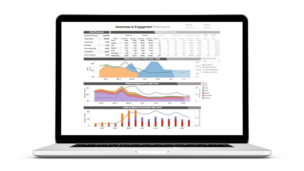
Nothing’s better at simplifying and clarifying marketing data than a dashboard. A well-designed dashboard brings your most important data together in an updated visualization, giving your team the ability to quickly assess marketing performance and spot previously unseen trends.
But building a high-quality dashboard can be anything but simple.
Fortunately, this is an area where Alight Analytics has some experience — well, maybe more than just “some.” Our professional services division, creates comprehensive, easy-to-understand dashboards for brands and advertising agencies across North America. Our experts know exactly what makes a marketing dashboard work.
If you’re building your first dashboard, or if you’re looking to sharpen your viz skills, check out this quick and dirty guide for a few useful tips from our team.
Who Is Your Audience? And What Do They Need?
When you’re building a marketing dashboard, the very first step is to be clear about why the dashboard needs to be built.
That means understanding who’s going to be looking at it and what kinds of information they’re going to require.
Have a discussion with the person who’s going to be making decisions with your dashboard, and brainstorm with them. Ask them:
- What is the dashboard’s purpose? Why do end users need it? What kinds of questions should it answer? (And what should it not attempt to answer?)
- What are users likely to change in their marketing as a result of this dashboard?
- Who else will be viewing it, and when, why and how will they use it?
Be careful: Dashboards shouldn’t include too much data. Resist the impulse to include metrics that aren’t going to be used to make decisions. Think about what your dashboard users really want to know about.
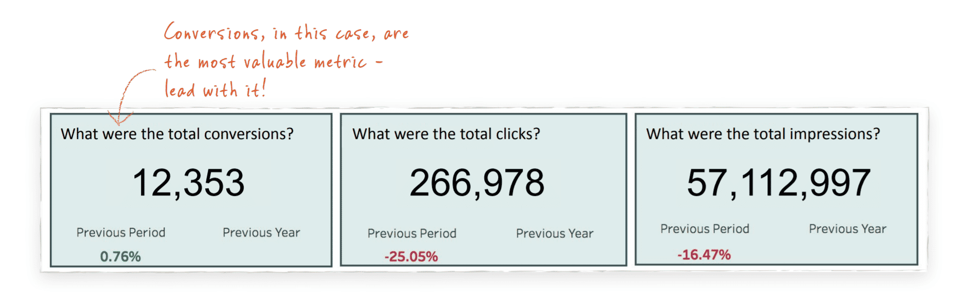
For example, a lot of marketers like to start their reports by showcasing how many impressions their campaigns generated (because this is usually a big number) and then mention how many conversions or sales were generated (which, uh, isn’t always as big).
But really, are any decisions being made based upon how many impressions you got? For most businesses, the conversions are the most important number and the number that drives optimization decisions. Lead with conversions.
Visualize Your Visualization
Once you know the data points your dashboard should include, its intended audience and the questions it should answer, you can create a mock-up — rough sketches of how the dashboard will look, how you’ll visualize specific measures and how you’ll lay things out. (Whiteboards are awesome for this.) Spend a little extra time here, and the process of building the dashboard will go much faster.
As you sketch things out, look for ways to illustrate correlations between different types of data. An easy example would be: As traffic to our website increases, do we see a similar increase in conversions? If not, then we should be asking ourselves if our campaigns are getting in front of the right people or if our website is effectively ushering customers through the right funnels. Keep seasonality in mind. Are certain times of the week, month or year busier or slower than others? Are you comparing relevant time frames — by quarter instead of month or day?
It’s critical to get buy-in on the design concepts before you start building. This will help you dodge so much heartache down the road because you’ll ward off silly layout changes, identify missing data points early and prevent an overcrowded dashboard when everyone comes to you with “one more change.”
Build a Dashboard That Communicates Clearly
When you’re finally ready to build your marketing dashboard, keep the following guidelines in mind:
- Aim for simplicity. Give users a sound bite they can walk away with. Use easy-to-understand numbers.
- Don’t try to do too much. Answer one business question with a visualization.
- White space is a good thing. Spread things out, and your users won’t feel overwhelmed.
- Use questions (not titles) to label graphs and visualizations. Ensure the graphs answer the question.

- Larger fonts will be easier to read.
Use color to communicate:
- Choose brand colors when possible.

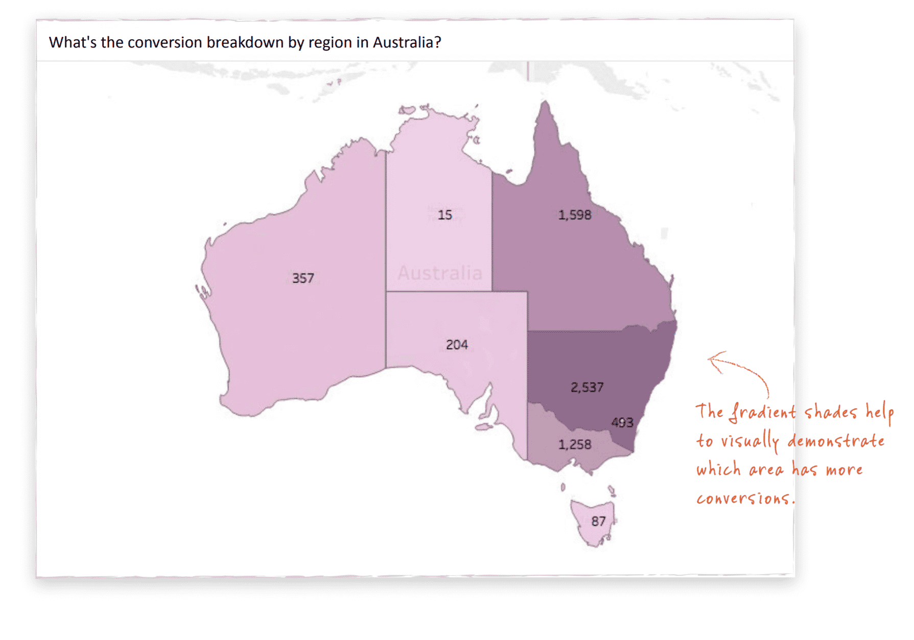
- Use solid, differentiating colors when you need to include different categories. But gradients — or shades of the same color — can be used to show degree or rank.

- Be consistent with color. Don’t use the same color for different measures.

Try to put results in context:
- Use benchmarks or progress numbers to indicate how the latest numbers compare to your previous results. Are sales up 10 percent from last month? Down 5 percent from last year?
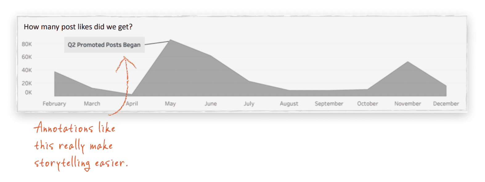
- Annotations — noting when important campaign-related events occurred — can be very powerful for helping users understand the story behind your data.

- Data labels — text boxes that list numbers for certain points in time — can be very effective. This is especially true when you’re listing dollars. It’s less important when you’re visualizing impressions.
Find ways to explain terminology or information that might be confusing. That might be a “definitions” page that spells out what certain terms mean. Or you could create a view or a pop-up box that includes clarifying info.
The Finishing Touches
-
- Go back and check the underlying data to make sure your visualizations are accurate. You don’t want to create a dashboard that uses daily numbers for a monthly viz, or vice versa.
- Great marketing dashboards should also pass the 5-1-5 rule. Within 5 seconds, a user should be able to understand what a visualization is displaying. Within 1 minute, a user should be able to extract a business insight. Within 5 minutes, the user should be able to make a decision.
- After you’ve built your dashboard, go through it with a fine-tooth comb. Invite someone who isn’t involved with your project to take a look, and ask them to point out things that don’t make sense.
- And be ready to give your users a “test drive” of your dashboard. Show them all it can do.
We love dashboards, and we hope you do, too. If you’ve got questions about this guide — or are interested in hiring our team — contact us today!