The Kansas City Chiefs play the Baltimore Ravens on Dec. 9, and the team at Alight Analytics has a few data-driven insights into how the game might go.
Ryan Abernathy and Ryan Chin, two of Alight’s reporting solutions analysts, used Tableau to build a visualization that illustrates how the Chiefs and the Ravens have performed so far this season and what their key strengths are.
 Chin and Abernathy created the project during the Nov. 12 meetup of the Kansas City Tableau User Group.
It was part of a “viz-a-thon,” a competition where everyone had 90 minutes to build a visualization using nine weeks’ worth of play-by-play data on the Chiefs and Ravens. The Ryans’ project took second place in the viz-a-thon. Since the contest, they’ve updated a few details — you can check out the dashboard here.
Here’s what the guys had to say about their project.
What does your Tableau dashboard show?
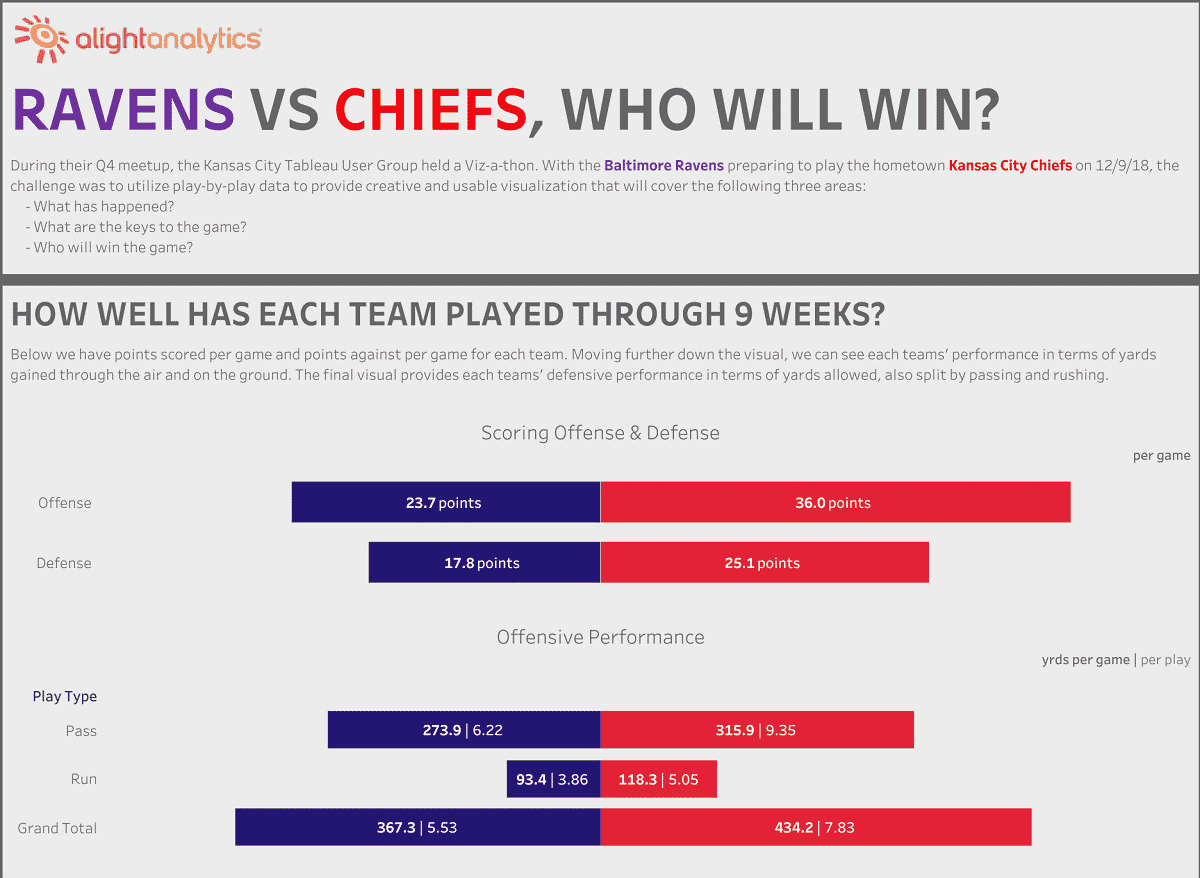
Ryan Abernathy: The first portion of the dashboard was meant to tackle the question, “What has happened for each team during the 2018 season?” It is an overview of each team’s overall statistical performance through nine games.
The teams are clearly distinguishable by the colors and division of the dashboard. At the top, we have points scored per game and points against per game for each team. Moving further down the visual, we can track each teams’ performance in terms of yards gained through the air and on the ground. The final visual provides each teams’ defensive performance in terms of yards allowed, also split by passing and rushing.
As we can clearly see, the Chiefs are far superior to the Ravens in terms of offensive prowess, while the Ravens hold a clear advantage defensively. To determine who would win the game, we decided to pit these two strengths against one another.
Ryan Chin: The second section of the dashboard is our attempt to display which would fare better in their upcoming matchup — the Chiefs’ passing offense or the Ravens’ passing defense. With the vertical axis serving as the distance of the play and the horizontal axis as the position of the field, this chart is meant to emulate a football field.
Each position of the field is colored based on who has had more success in that area of the field. Overall, the Chiefs have been more successful executing on passing plays than the Ravens have been in defending them.
Did you learn anything interesting about the teams as a result of the visualization?
Ryan Chin: Being in the KC area, it’s easy to feel confident that we can win every game, but I think the data shows that Baltimore might be a tougher matchup than their record suggests.
That’s due to the Ravens’ defense. When we built the dashboard, they were 4-5, but have since won two in a row. They currently have given up the least amount of points, per NFL.com.
Is there anything about this project that you’re particularly proud of?
Ryan Abernathy: I’m pretty pleased that the end product was easy for everyone, even non-football fans, to understand. The ultimate goal for those of us who build these visuals is to empower the user. We want them to understand what they are seeing and feel confident using the tool.
Anything else you’d like to add?
Ryan Chin: The viz-a-thon panel, which consisted of Ryan Sleeper and Sean Miller, had great feedback for our submission on how we can better represent the data, which we implemented to improve upon our viz.
It was also great to see so many people in the KC area come out to compete. There were a lot of different and creative approaches that other teams took to answer the problem. It’s inspired us to keep on learning and expanding our Tableau knowledge.