

A lot of marketers hate reporting. And I think part of the problem is that a lot of us are simply bad at building marketing reports.
Every month, we Crazy-Glue together these 90-slide PowerPoints that literally nobody wants to read. Or we gather everybody in a conference room and shotgun statistics at them for 30 minutes.
This is a big problem because reporting is how we as marketers prove that our work matters. Good reporting should show our audiences how the money they spend is helping their organization make money or achieve some other core goal.
So if our reports aren’t doing that, we undermine our company’s trust in marketing — and their willingness to spend money on marketing in the future.
There are three big (and fixable) reasons why marketers struggle to produce useful reporting.
1. Not Being Efficient with Data
Too many marketers are using manual processes to gather data for their reporting. I call it the Data Death March.
It all begins with people going out and manually pulling data from Facebook, Google and other sources. Then they open up those files in Excel and create pivot table after pivot table.
If you’re fancy, you’ll build some basic charts and then cut and paste them into a PowerPoint deck that you present to your boss or your clients.
Then finish it all off with a prayer that nobody asks you any questions, because if they do, you might have to re-do the whole thing.
This is an extremely time-consuming way to build a report. And because you’re so busy just doing basic reporting, you don’t have time to analyze it and make useful recommendations.
Manual processes are riskier, too, because they introduce more opportunities to make a mistake with your data.
The solution? You need to automate data aggregation — from all your data sources — with a technology solution that can capture, clean and unify your data. By doing this, you’ll be able to flip the time you spend gathering data to time spent actually analyzing the data.
2. Focusing on the Wrong Metrics

Great reporting shows how marketing investments help generate revenue. Because, ultimately, that’s what marketing is supposed to do.
The key word is revenue. Not impressions, not clicks, not share of voice. Revenue.
Instead, a lot of us are building our marketing reports around feel-good, vanity metrics. “Hey, look at me, I generated a million visits to my website last month.”
Nobody cares — unless you can show how all those website visits translated to revenue.
For example, how do my million website visits impact conversions and sales? That’s the question I should be answering, especially if I’m presenting data to any kind of decision-maker.
Good reporting should also include optimization metrics, like cost per lead or conversion rates, but even then, you should be using that information to boost revenue.
How many website sessions does it take for someone to become a lead or make a purchase? How much does it cost me to generate that engagement online? And what did that engagement ultimately yield?
Some of you are going to be saying, “But, Matt, I don’t have access to sales and revenue numbers!”
If you can’t get to sales or revenue, get to the next best thing. For many of us, that’s leads, and you can get that data. Purchase intent isn’t the strongest metric, but it’s a start.
“But, Matt, I’m a distributor, and I don’t get point-of-sale data.” No, but you do have shipment data and other things that you can use to quantify your impact on the bottom line.
One caveat: Does this mean you should never look at impressions or engagement?
No. For media buyers, channel managers and other people who are building and executing campaigns, they really do need that information. It’s how they optimize what they’re doing. Set up a separate dashboard that shares that information, and it can be really useful.
For everybody else, though? Your C-suite people, your marketing directors and other decision-makers — those audiences need to see how marketing impacts revenue.
3. Using the Wrong Tools

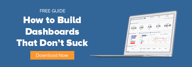
Not to be dramatic, but PowerPoint is the devil. A lot of us are building 90-slide decks every month when we should be using a marketing dashboard to report on performance.
One dashboard can replace an entire stack of PowerPoints because a dashboard can constantly refresh its data and give your audience the power to explore that data on their own.
That’s another reason I really dislike PowerPoints: They’re so slow. I literally have conversations today with agencies where I’ll ask about their analytics strategy. And the response I often get is, “Well, we do reporting once a month.”
What the hell? Once a month, are you kidding me?
You aren’t looking at results and sharing those with your clients more than once a month? What about daily? What about being active and demonstrating the value that you’re delivering to your client on a daily basis?
“Well, man, it’s so hard. We use PowerPoint. It just takes so long.”
You can’t let crappy tools be your excuse for providing substandard reporting. You have to change your mindset.
Build a dashboard, one that automatically refreshes its data. Doesn’t even have to be very fancy — you just need to show how much you spent and what happened as a result. You can do that with a pipeline visualization like this one.
Are You an Expense or an Investment?
At the end of the day, marketing is either one of two things. It’s either an investment, or it’s an expense.
If you’re showing up once a month with giant PowerPoint decks to talk about how much engagement you created and how many clicks you generated, then marketing is an expense. It has absolutely no value to me.
But if you can put your data into context? And show how marketing is making measurable contributions to your organization’s goals?
You’re justifying last month’s budget and making the case for future investment. Because, remember, that’s what marketing really is — an investment.
Making that case begins with better reporting. If you’re ready to upgrade your marketing reports, let our team know. We’d love to help!
Streamline Your Reporting with ChannelMix Analytics
Say goodbye to PowerPoint. ChannelMix’s end-to-end analytics solutions give you everything you need to accelerate your reporting, including ready-to-use dashboards and seamless data aggregation. Schedule your demo today!