

The job isn’t done when your marketing campaign wraps up. You still have to report on how everything went, so you can understand what worked, what didn’t and how you can make things better next time.
You need to create a marketing report.
In this post, you’ll see …
- Why reporting is essential for proving marketing’s impact and optimizing marketing strategy
- How to create a basic reporting strategy to make the entire process more effective and efficient
- How to make your marketing reports more user-friendly with a set of best practices
- How marketing reports can be structured to answer your users’ most important questions

What Is Marketing Reporting? And Why Is It Important?
Marketing reporting is the process of collecting relevant performance data from a campaign, analyzing and summarizing it, and then communicating your findings to your audience — whether that’s your boss, your client or even just yourself.
It can be as simple as saying: “We spent $1,000 last month on search ads and generated 12 new leads, which was above the goal for this campaign. Based on past performance, those leads should eventually lead to $4,000 in new revenue.”
In two sentences, you’ve answered some very important questions:
- How much did we spend?
- What was the result?
- Did we achieve our goal?
- How will this impact the organization?
Reporting is important because …
- It’s how marketers show that their work (and the money they spend) has a real and measurable impact. Decades ago, marketers couldn’t really prove their budget led to higher sales. Sure, maybe sales were higher last month, but they couldn’t say if their ads were the cause, or if there were multiple ads, which ones were responsible. Maybe it was the weather! The birth of digital advertising has changed the game. Now we can more easily quantify marketing’s impact, whether that’s in terms of sales, website sessions, ad impressions or some other metric.
- It helps marketers make smarter decisions going forward. Reporting shows you what worked and what didn’t, and at a basic level, you can use that information as you start planning your next campaign. Social didn’t generate a single website session for you? Maybe you won’t spend as much on Facebook next time, or maybe you need to rethink your creative.
Why You Need a Reporting Strategy
While reporting is important, it isn’t always fun or easy for marketers. A lot of us struggle with it because there’s too much data scattered over too many platforms, which turns reporting into a time-consuming chore. Sometimes it isn’t clear what information our audience actually needs. (Or if it’s even possible to answer their questions.)
That’s why it’s important to have a reporting strategy — a plan that streamlines the process of reporting on marketing performance.
Identify Your Audience and the Information They Need
The best reporting isn’t one size fits all. It should be tailored to the person using it. A CEO might be more concerned about revenue, market share and other bottom-line concerns, for example, while your PPC team will want to know about the success of specific campaigns.
So, once you know who you’re reporting to, write down a list of their most important questions. In a perfect world, you should ask them what they want to know.
Once you know the questions, then you can identify the metrics that will allow you to answer those questions.
Let’s say you need to create a report for the marketing director at a local real estate company. That person needs to know if their PPC campaign is successful.
Their most important questions are …
- Are we generating enough leads from paid search?
- Which can be answered with the number of goal completions (in this case, form fills) on the company’s website, as measured by Google Analytics
- Are we being efficient with our budget?
- Which can be answered with cost per click and cost per conversion numbers from Google Ads and Google Analytics
(What you’re doing here is creating a measurement strategy. This blog post breaks down that process in greater detail.)
Choose the Best Way to Share Your Reporting
Reporting Frequency
Is your marketing report being used to optimize a campaign that’s currently running? Then you’ll need to find a way to share updates more frequently — weekly or even daily.
Or maybe your audience is taking a longer view. If they’re looking at marketing ROI for an entire campaign or department, then you might produce reports monthly or quarterly.
Marketing Reporting Tools: Spreadsheets vs. Marketing Dashboards
For years, most marketing reports were delivered as spreadsheets because, well, that’s the only tool that marketers had. It wasn’t always thrilling, but spreadsheets could convey large volumes of information in a clear, organized way.
Even today, an Excel file might be the perfect way to share data with a hardcore data expert who wants to explore the raw numbers on their own.
For most audiences, especially people who don’t work with data as part of their daily routine, you should probably use a marketing dashboard or some other kind of visualization. Using a chart or graphic can make even complex data easy to understand at a glance.
Even better, a dashboard can be built so that its data is refreshed every day, automatically.
The good news is that it’s never been easier to find tools for building dashboards:
- You might already be using a tool (like HubSpot or Google Analytics) that can produce dashboards for you. These are usually easy to use, but might be hard to customize or use with data from outside that tool.
- You could use a basic dashboarding tool like DashThis or Google Data Studio that’s either low cost or free. They often have pre-built templates that make it easy to stand up a new report quickly. Again, you might find it hard to build your dashboard exactly how you choose.
- Or you could select an enterprise-class visualization platform such as Tableau or Power BI. There’s a learning curve, and they tend to be a little more expensive, but you can build essentially anything you envision.
Building Your Marketing Report
There are a number of BI and dashboard software tools available for creating reports, each with their own features and capabilities. But there are best practices that apply across every kind of platform, including:
Before You Doing Anything Else, Create a Mockup of Your Dashboard
Physically draw it out using a piece of paper, whiteboard or whatever tool you prefer.
Ask yourself: What types of questions will your report be answering? What kinds of charts will you use to visualize each metric? Refer back to the list of questions you produced in the previous section.
With a mockup, you’re not just drawing a picture — you’re forcing yourself to think through how your dashboard should work. A lot of people skip this step. They open up Google Data Studio, Tableau, Power BI or some other tool, and they just start building.
But, because they didn’t create a mockup first, they often have to go back and redo everything they built.
One Question Per Chart
As you’re designing your dashboard, a good rule of thumb is to have every chart answer a single question. In fact, you could even have that question be the title of your chart.
This is a good discipline because it forces you to justify each chart that you include in your report.
Choose the Right Chart for Your KPI
Different kinds of charts are better for visualizing different types of data.
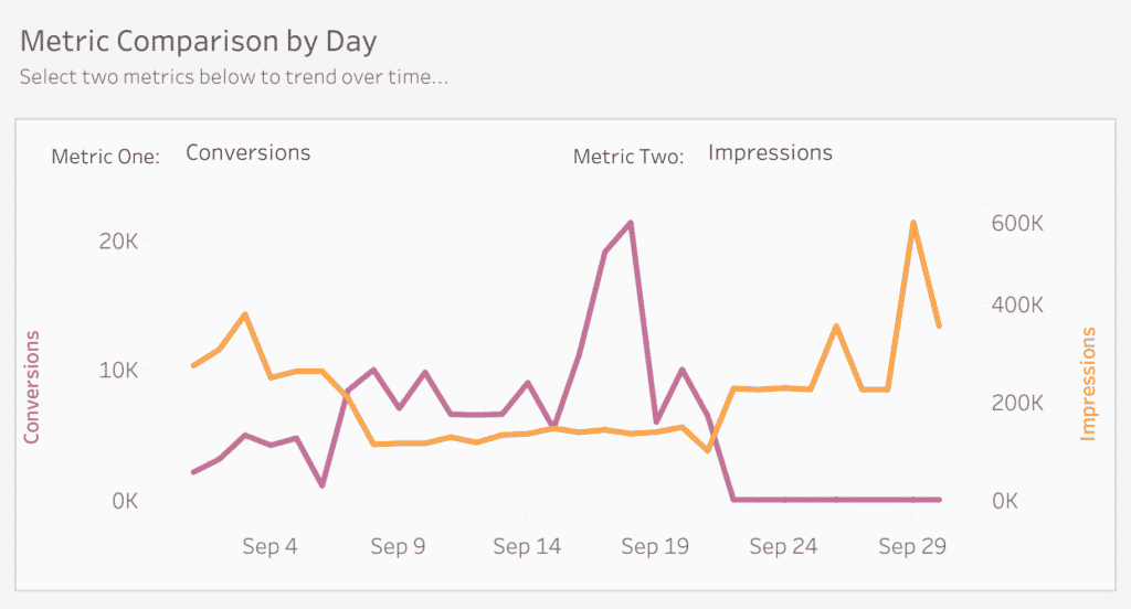
Looking at how a metric (or two metrics) change over time? You need a line graph.
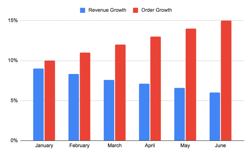
Need to compare the size, shape or scale of different products, categories or groups? A bar chart makes accurate comparisons easy.
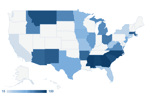
Comparing the general performance of regions and territories? Try a color-coded map.
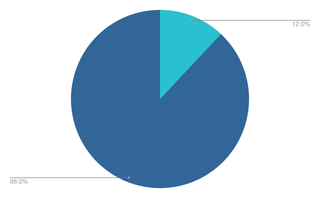
Pie charts are great for showing the relationship between the part and the whole. For example, if you wanted to show how much of your overall revenue is due to Product A.
Even the humble table can be useful to include if you want to create a ranked list or give your audience access to more detailed metrics.
Test Your Report with the 5-1-5 Rule
Before you share your report with your audience, it’s a good idea to test it for user-friendliness. We recommend the 5-1-5 Rule. Ask yourself …
- Within 5 seconds, can your audience easily understand what kind of data your report is sharing? (“Oh, this dashboard covers email campaigns …”)
- Within 1 minute, can your audience use the report to gain a useful insight? (“Looks like conversions are down for this customer segment …”)
- Within 5 minutes, can your audience use the report to make a business decision? (“We need to change up our offer for this segment — let’s use the offer that’s been successful for this other segment.”)
Examples of Marketing Reports
If you’re reporting on organic social, you might use a marketing dashboard like this one.
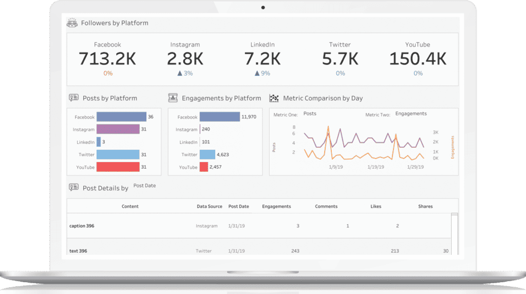
The dashboard can help your audience answer some useful ongoing questions, including:
- How much content are we producing for social? (Which is answered by the “Posts by Platform” chart of how many posts were published on each platform.)
- How engaged is our audience? (Answered by the “Engagements by Platform” chart and the “Metric Comparison” chart that compares number of engagements versus number of posts.)
- What is our top-performing content? (Answered by the “Post Details” table at the bottom of the report.)
What if you’re reporting on lead generation? You could use a dashboard like the one below.
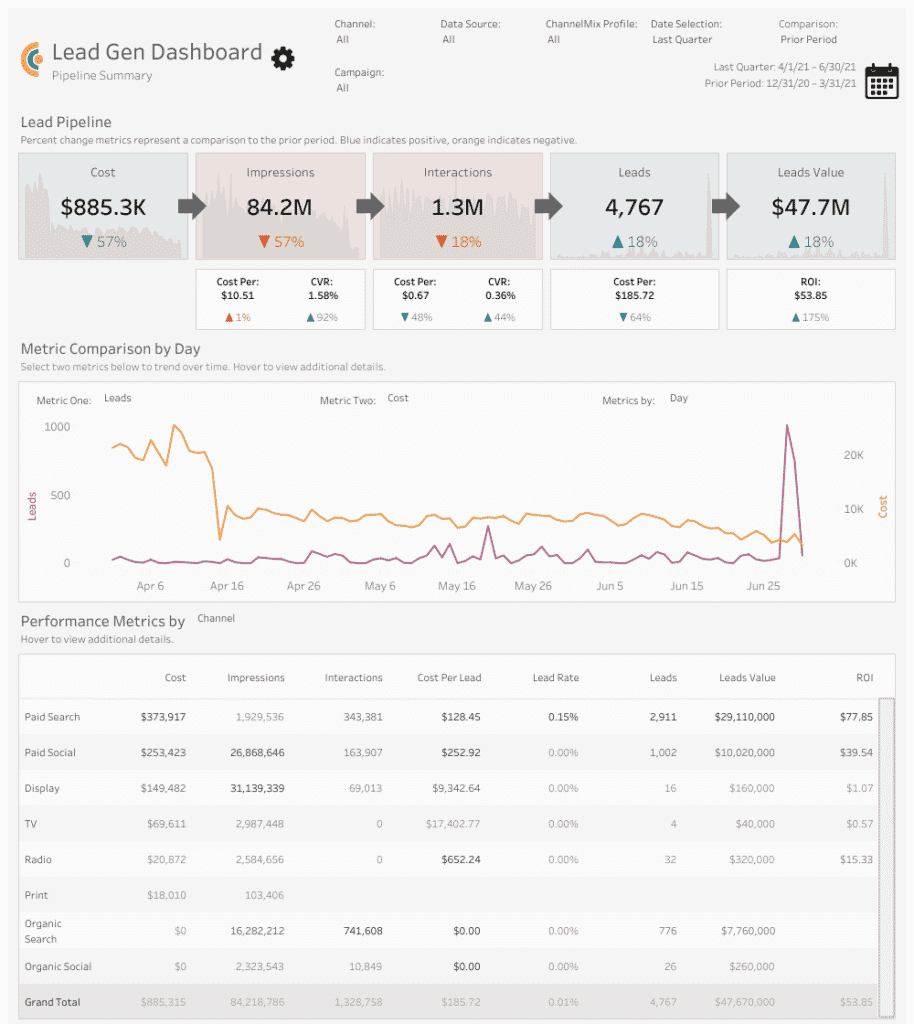
With this report, you can see:
- How much you’re spending on marketing and what your investment is delivering at each step of the funnel in terms of impressions, interactions and leads. (As answered by the “Marketing Funnel” chart.)
- How the number of leads trends against the level of spend over time. (As shown by the “Metric Comparison” chart.)
- Which channels are most effective at generating leads. (Answered by the “Performance Metrics” table.)
Need Help with Your Marketing Reporting?
Alight’s analytics solutions — including our ready-to-use marketing dashboards — can get you up and running ASAP. Schedule your demo today!