In a perfect world, a good chart should make it easier for the average person to understand marketing data and use it to make smarter decisions.
But that doesn’t always happen. Sometimes, a visualization can mislead us and obscure what the data is actually saying.
In this post, you’ll learn how to spot four of the most common ways that charts lie and gain some best practices for avoiding these kinds of errors.
#1 – Charts That Make It Difficult to Make Comparisons
Let’s say you need to set your advertising budget for next quarter, and you want to put more money behind the tactics that are really getting results.
You might start by looking at which marketing channels generated the most conversions.
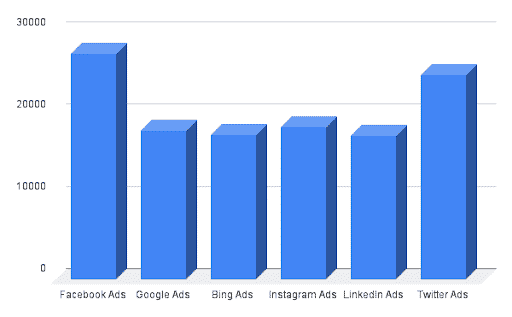
Not easy to pick the top channels with this chart, is it?
You can probably tell that Facebook Ads created the most conversions, followed by Twitter Ads. But you might have trouble putting the other sources in order because it’s hard to see which ones are taller than the others.
That’s because the chart is using 3D imagery, which makes comparisons harder.

Look what happens when we flatten the bars and add some grid lines. Most people can now put the channels in order.
If you wanted to, you could add numerical labels to make the rankings perfectly clear — though as Alberto Cairo, author of “How Charts Lie,” notes:
“A good graphic should let you visualize trends and patterns without having to read all the numbers.”
#2 – Charts that Skew the Data
Next chart: Now you want to compare Facebook and Twitter conversions. Which one should get more money next quarter?
It looks like Facebook recorded higher results for most of the last quarter, but it might be on a downswing while Twitter’s performance is picking up.
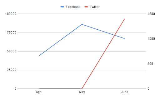
Except they’re not using the same units of comparison — something that can pop up when a chart has two Y-axes, like the one above does.
The one on the left is for Facebook, and its units are in the thousands. Twitter’s is on the right, and it uses hundreds.
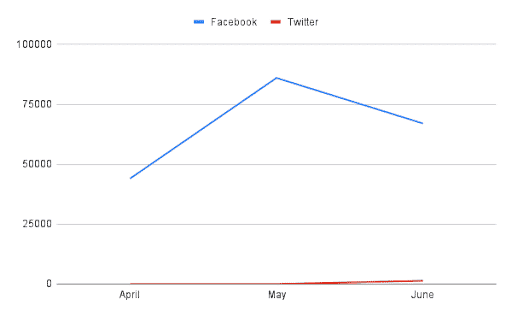
What if you rework the chart so there’s just a single Y-axis using the same units of comparison? You get something like the chart below, where it’s much easier to see the difference between the two platforms.
#3 – Charts That Use the Wrong KPI for the Question Being Asked
This pie chart shows how many clicks each of your marketing channels delivered. Based on these results, what percentage of your budget should you spend on Bing (the yellow slice) next quarter?
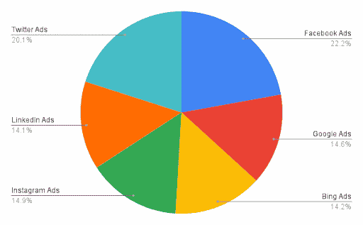
Unfortunately, you can’t really make a good decision because the chart is out of context.
You can see how many clicks each platform logged, sure, but you have no idea how much money each platform received to generate those clicks.
What if Bing generated 14 percent of all clicks to your site, but it only received 1 percent of your advertising dollars? That’s a fantastic return on investment — you might consider spending more money on Bing next quarter.
Instead of visualizing your data with a pie chart, maybe you use a different KPI, like cost per click, in a different type of visualization, like a bar chart.
#4 – Charts That Look at a Narrow Window of Time
Last one: Your team shows you that spending is down significantly between March and April — more than 30 percent. Sounds like they’ve been pretty judicious with their budget, right?

Except that’s not the whole story. Here’s what spending levels look like if you report on more than just two months.
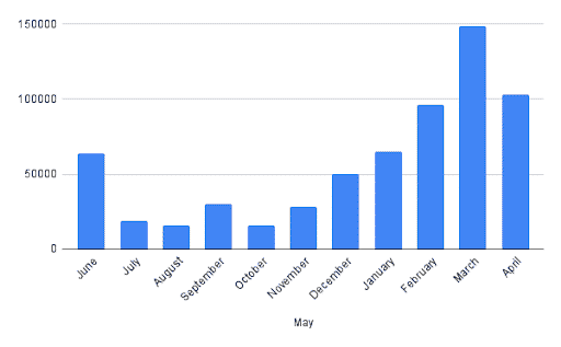
So, technically, April showed a 31 percent decline in spending. It still happens to be the second highest month for spending on record.
Data needs to be put in context. Cairo has some good things to say here, too:
“Usually, a single week’s or month’s variation may not be worth your attention, as it could be part of the product of reality’s inherent randomness.”
(By the way, if you’re interested in this topic, you should definitely check out “How Charts Lie.”)
Good data visualization should make it easier to find the truth, not obfuscate what’s really happening. The key is to use charts that make it easy to make accurate comparisons and that give the necessary context around the data being shared.
Marketing Dashboards You Can Trust
My team at Alight specializes in making dashboards that help marketers make data-driven decisions. We’d love to help you do the same. Schedule a demo here to get started.
