

If there’s a Golden Rule for visualizing data, it’s this:
Good visualizations make it easy to compare values.
It’s not enough to say that last quarter’s marketing campaign generated $1 million in new revenue. Your chart should help your audience understand if that number was larger or smaller than the previous month or the previous year, or how it compares to historical averages or industry trends.
By putting your results in context, you explain why that number is significant, which can then help your audience make better business decisions.
As it happens, visualization is perfect for highlighting the differences in data.

Why Visualization Is So Important for Understanding Data
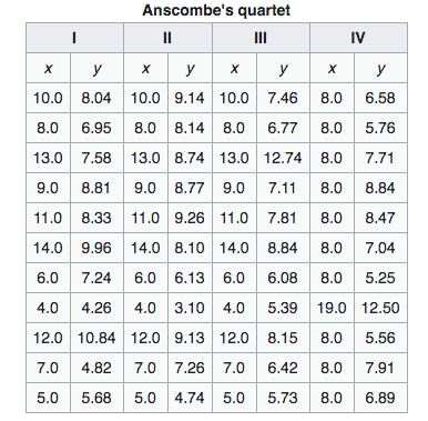
Back in the 1970s, a statistician named Frank Anscombe came up with a clever way to illustrate this point.
He created four datasets that were very similar in terms of mean, variance and other qualities. If you look at the datasets in a table, you might have trouble telling them apart.
But then Anscombe put those values into a series of charts. Suddenly, it’s very easy to see how each dataset is unique, in a way that you couldn’t tell by viewing the numbers alone.
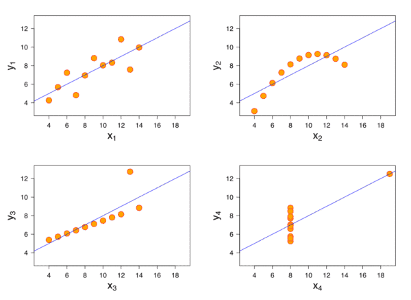
And that’s the magic of visualization. It takes numerical values and translates them to a format that makes it easy to compare and contrast the values involved. A number becomes “embodied” as a bar, a line segment, an area chart or some other visual.
Choosing the Right Type of Data Visualization
Because of how our eyes and brains work, human beings are better at using certain visuals for certain types of comparisons.
This is called graphical perception. This concept was developed by statisticians William S. Cleveland and Robert McGill in their landmark paper from 1984. They ran a series of tests to see which types of charts were easier for people to read and understand.
As a result of their research, Cleveland and McGill were able to create a hierarchy of graphical perception. For example, if you need to make a very specific comparison, your best bet is by comparing positions along an aligned scale — which is a fancy way of saying a dot chart or a bar chart.
The next best option is comparing positions along a nonaligned scale, i.e. you create a bunch of bar charts that use the same metrics on their axes and compare them side by side.
Cleveland and McGill discovered it was harder for people to accurately compare values with charts that used length, area, angle or volume to visualize data. Pie charts, stacked bar charts, bubble charts — they’re all in this muddy middle.
Color and shading, like you might use in a heat map, were least useful for comparing specific values.
Match the Visualization to the Task at Hand
Does that mean that color-based visualizations or pie charts are bad and should never, ever be used? Nope! It depends on what you’re trying to accomplish.
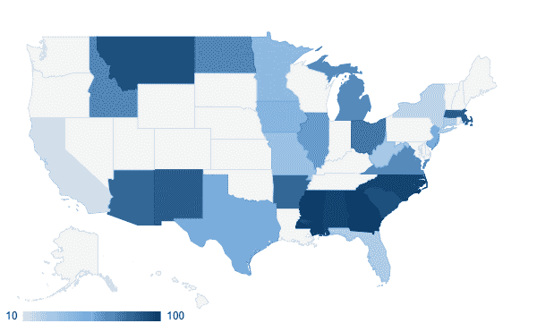
If you’re trying to show the differences between regions on a map, color can be a quick, effective way to illustrate those relationships. In the map below — even without knowing the exact values or what the colors represent — you generally get a sense of how California compares to Texas or the South.
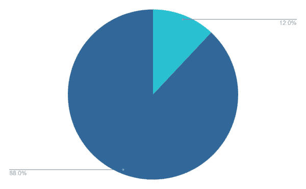
A lot of designers and analysts avoid pie charts, partly because a bar chart can usually convey the same information in a way that’s easier to grasp.
But there might be situations where a pie chart could be helpful. If you’re visualizing just a few values — and those values are substantially different — a pie chart can illustrate the relationship between a part and the larger whole.
It all comes back to your audience and helping them understand the data so they can use it to make better, more informed decisions. Doesn’t matter if you are building a simple bar chart or a dashboard with a half-dozen tabs and 20 data sources. Your data visualization must make it easy to compare values.
Ready-to-Use Dashboards for Marketers
Alight’s end-to-end analytics solutions feature a full suite of ready-to-use dashboards for cross-channel reporting, multi-channel attribution, pipeline forecasting and so much more. Set up a call to learn more!