Early in my career, I’d say “a good marketing dashboard should be built so any reader with any level of experience can read it and understand what it is talking about.” And I’d say that often, much to the annoyance of my coworkers.
It turns out building an easy-to-read dashboard is easier said than done. The more metrics you add to a dashboard, the harder it is for the audience to read it, no matter the
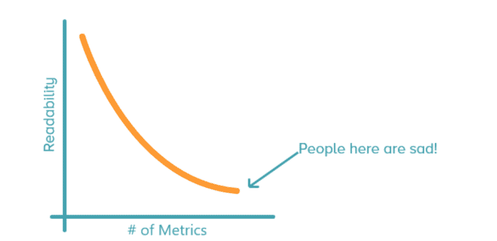
The reason that a dashboard becomes harder to read as you add metrics is fairly simple — it’s information overload. A simple chart like this one is easy to understand.
But that chart added to a dozen others takes a lot more work to interpret. (That’s why we sometimes advocate keeping large dashboards to a minimum.)
Some BI developers might break up these dashboards into smaller reports each containing three or four visualizations. That’s not necessarily a bad idea and can work depending on the circumstance. However, that makes the assumption that dashboards are only meant to answer one or two questions about a marketing strategy.
Some dashboards are meant for a much bigger purpose. They might be providing a one-stop shop for a broad range of metrics, from website sessions to cost per clicks to Facebook impressions.
Even when a dashboard narrows down to one subject, such as Facebook tracking, it can be a challenge to include that all on one page. There are page impressions, post impressions, paid impressions, paid clicks, link clicks, etc. Many of these metrics sound the same. Building a dashboard that covers the broad range of Facebook data means building a multi-page dashboard, especially if the stakeholder likes to dig deep.
So how can you communicate all that data in a clear way? Simple — take a clue from how journalists structure newspaper articles.
How Are Newspaper Articles Structured?
There is a concept in journalism called the inverted pyramid. The more important, big picture details are always at the top. That includes the who, what, where, when, why and how. The middle level contains other important details, such as interviews or indirect causes for the news event. The last level gives general information concerning the background of the story.
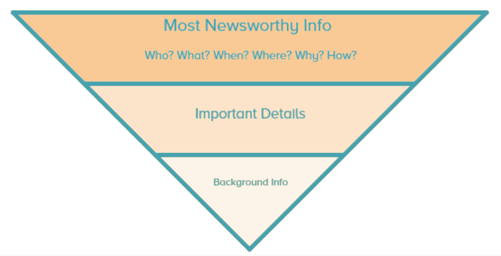
This method of outlining is used for the vast majority of newspaper articles, from your local paper to The Wall Street Journal. The reason newspapers do this is because journalists know most people won’t read the entire article. Readers should be able to read a paragraph or two and get the gist of the story. If they’re interested, they can dig deeper by reading further.
How Could That Apply to Marketing Dashboards?
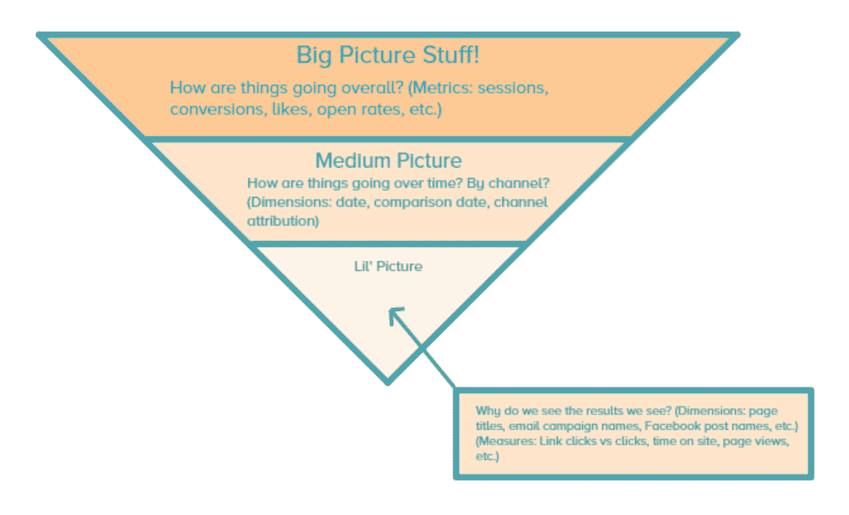
If I could draw an inverted pyramid for dashboard design, it would be this:
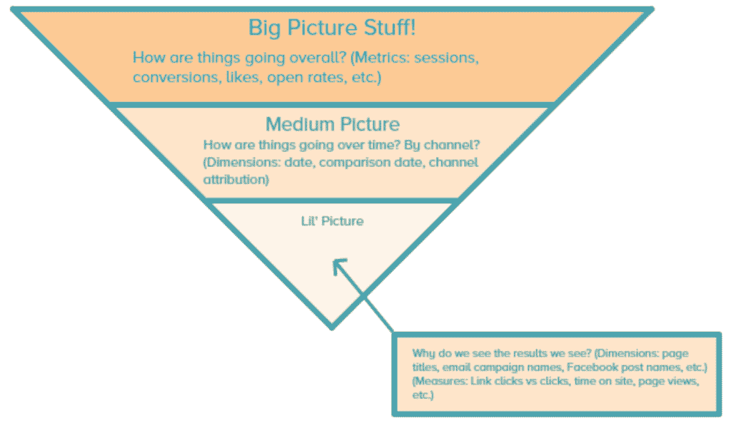
Big Picture Metrics
The big picture metrics easily answer the question “how are things going overall?” These metrics are generally easy for laypeople to understand and are what business leaders would look at first. With marketing metrics, that often includes things like sessions, conversions, social media likes, email opens, etc.
Medium Picture Metrics
The medium picture metrics add more context to the high-level metrics. It typically takes something like sessions and breaks it up by channel attribution and a date range. These metrics are still easy for laypeople to understand and would prompt the reader to ask questions, such as “Why was there a spike in sessions in April and then a drop in May?” or “Why did paid social contribute more to our conversions when we spent more on paid search?”
Lil’ Picture Metrics
The lil’ picture is where more granular information is presented. This can be actual data tables or charts, depending on the request. Typically, this is the data that subject matter experts or analysts would care more about and helps answer the questions prompted in the medium picture section. So if the report reader asks “Why did paid social contribute more to our conversions when we spent more on paid search?” this section would answer that. It might have a table that breaks down the content of the Facebook Ads, and you might see that one piece of creative was really effective.
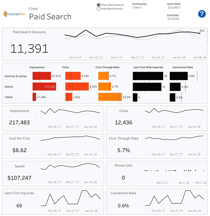
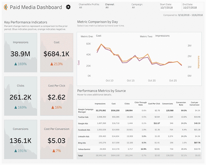
How would this translate into a dashboard? If it’s a single page, it would be something like the marketing dashboard below. You’ll notice the big picture metrics (impressions, cost, clicks, etc.) are on the left. On the top right is the medium picture metrics (basically what’s on the left, but broken out by date). On the bottom right, we have the lil’ picture metrics. We break everything further down by data source.
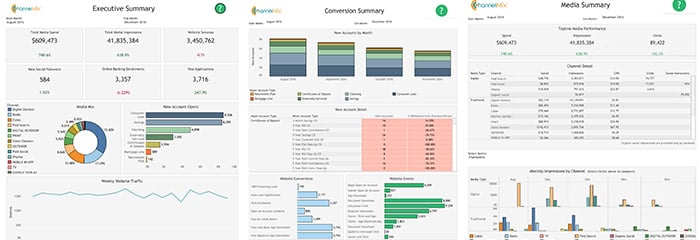
If this dashboard had multiple pages, it would look like the following. You’ll notice that the big picture metrics are on the first page, followed by medium picture metrics such as channel. As you go through the dashboard, you’ll move further and further down the inverted pyramid.
Another way to think about this is the deeper you dig into a dashboard, whether it is from left to right or top to bottom, the further down the pyramid you go.
Should I Always Follow This Guide?
No. Using the inverted pyramid is a general rule of thumb, which is helpful for when you’re starting out designing and building dashboards. Eventually, you’ll get good enough to know when to ignore it.
What If I Don’t Want to Design or Build My Own Marketing Dashboards?
Easy! Alight has two really simple (and really awesome) options to help out. You can use our templated dashboards to get started sooner rather than later. Or you can work with our team to build a custom dashboard to suit your needs. Contact us today to see what option is best for you! We love doing this kind of stuff!
Taylor Rodgers is the Manager of Reporting and Analytics at Alight Analytics.