Marketing dashboards are one of the most powerful resources in a marketer’s toolbox. Nothing beats a dashboard for condensing mountains of data into an easily understood, eye-catching format.
But only if people actually use the dashboard.
Nothing’s more frustrating than devoting weeks to the design and construction of a new dashboard, only for your end-users to look at it once and then never refer to it again.
Good news: There are several things you can do to make your marketing dashboard so helpful and attractive that users keep coming back to it.
As an example, we’ll look at the Paid Search dashboard template that Alight Analytics created for use with Tableau and our ChannelMix platform for marketing data aggregation. Here are some of the best practices our team follows.
Start With Good Questions
Before you begin building your marketing dashboard, it’s important to be clear about what the visualization needs to accomplish.
Start by asking good questions: Who are your end-users? And how will they be using this dashboard? What kinds of questions should it help them address?
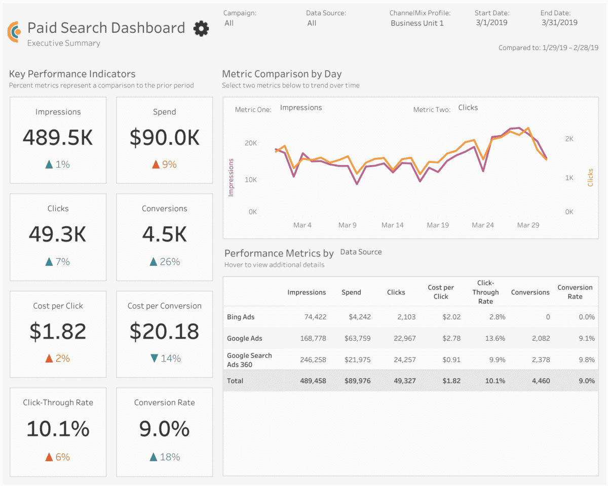
In the case of the Paid Search dashboard, it can be used by a range of users — media teams, channel managers, agency clients, C-suite leaders — to determine if their paid search ads are generating conversions, if those conversions are cost-effective and which search networks provide the best value.
Don’t assume you know what your users will want. It’s a good idea to have a conversation (or conversations) with end-users to make sure you’re clear about the dashboard’s goal.
Once you know who will be using your dashboard and how they’ll be using it, determine which metrics will address those questions. Is it impressions? Clicks? Conversions and conversion rate? All of the above?
Be careful about including metrics that really aren’t going to be used to make business decisions. Sometimes, it’s tempting to highlight vanity metrics — numbers that look good because they’re big
— but they don’t really explain what’s happening with your campaigns.
Take impressions, for example. They’re usually a big number, but alone, they won’t tell you how effective your media is. A ratio like click-through rate or conversion rate may better serve your purpose.
Don’t Overwhelm the Audience
When you have so much cool data to present, you want to put as much of it onscreen as possible. But don’t overwhelm your users. You want to make it easy for them to find what they need.
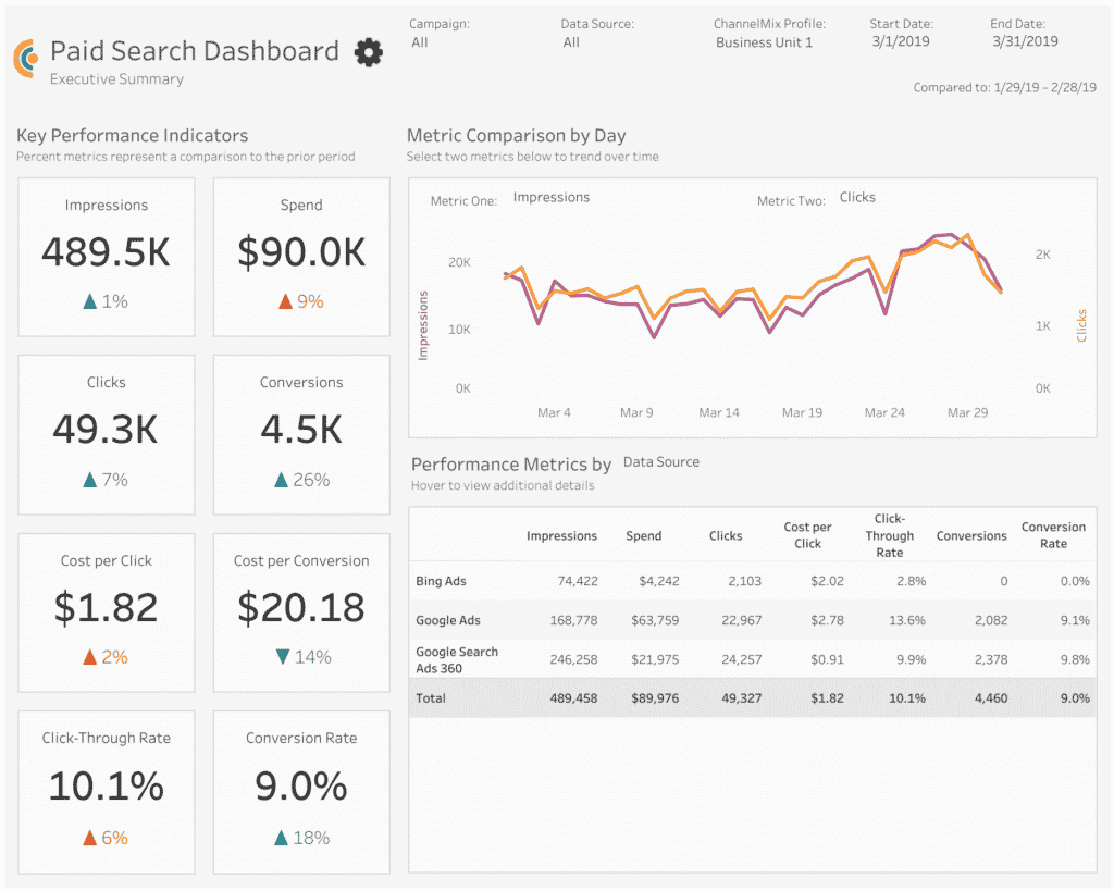
The Paid Search dashboard keeps things simple by only presenting three visualizations per tab. The dashboard still serves up a wealth of information — it’s just parceled out to other tabs dedicated to campaigns, ad groups, keywords and individual ads. Users can go directly to the information that’s most relevant to them.
And how you lay out the dashboard is important, too. It’s like your art teacher in high school used to say: White space is your friend. By leaving room between individual elements on the page, it makes the dashboard a little easier on the eye.
Empower Users to Explore the Data
Interactivity is one of the best things about marketing dashboards. It can empower your audience to dig deeper into the data and ask more detailed questions.
A good example is the Metric Comparison by Day section of the dashboard. Thanks to the Metric One and Metric Two filters, users can select which two metrics they want to compare against each other.
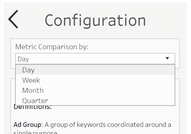
And it’s not limited to a day-by-day comparison. If you go to the Configuration tab — either click on the tab or the gear icon — you can choose the timeframe illustrated by the Metric Comparison section.
Put Your Results in Context
To understand what the data really means, you’ll also need to give your users context. So your paid search generated nearly 500,000 impressions last month — that’s great. But is that more or less than what you produced during the month prior?
There are a couple of ways this dashboard provides context for results:
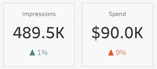
- Each Key Performance Indicator comes with an up or down arrow. Not only is there a label that shows the percentage change, the arrow is color-coded, too. A teal arrow means the KPI is trending in a direction that’s generally positive for marketers. A reddish-orange arrow represents a trend that needs to be watched.
- Using the date filters in the top right corner, you can control the timeframe illustrated in the dashboard. Underneath the date filters, a text label explicitly lists the period that’s being compared against.
Include Definitions
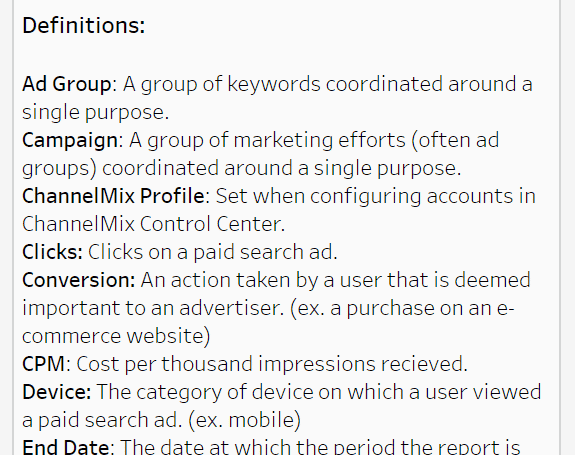
A great way to help users is to include a glossary of the terms and acronyms used in your dashboard. This dashboard stores them in a separate tab — easily findable, but not in the way of the main visualization.
You might be thinking: “Do I really need to include definitions? Everybody who’s going to be using this dashboard has been working as a professional marketer for more than a decade.”
In some cases, you might not need a definition, especially if you’re communicating with a small, sophisticated internal audience that “speaks marketing.” But most dashboards end up being shared with C-suite leaders and other departments that don’t have an extensive background in marketing, or that might benefit from the occasional reminder.
And that’s a good rule of thumb for every aspect of dashboard design: Always keep your user in mind. Always find a way to help them answer their most important questions.
Looking for Help With Marketing Dashboards?
- Need an advanced dashboard quickly, but don’t have the time to build it? Check out Alight’s suite of Marketing Dashboard Templates for Tableau. These ready-to-activate templates — for paid search, paid social, paid media, organic social and web analytics — effortlessly bring together multiple data sources in analysis-ready datasets, courtesy of ChannelMix OneView. Contact our team to schedule a demo.
- Our professional services team can build or co-build a marketing dashboard with you, the way we have for some of the nation’s leading brands and agencies. Let’s talk!