

You spent an entire week building your latest marketing dashboard and developing eye-opening insights into your last campaign.
But when you present the report to your boss … crickets.
We’ve all been there at one point or another. Analysis that you thought was incredibly important — and if we’re being honest, really is important— lands with a thud. What can you do?
More marketers are turning to the fine art of data storytelling. They’re combining narrative techniques with visualizations to make their insights more memorable, engaging and persuasive. Instead of giving a report, they tell a story.

Why You Should Be Telling More Stories
Stories can be a more effective way to present information because, well, have you met human beings? We love stories. Pretty much every facet of modern civilization — entertainment, news, advertising, politics, public health, religion, education, you name it — uses storytelling to communicate and motivate.
A good story is usually more engaging because it appeals to our emotions, which can impact everything from motivation to memory.
There’s even a biological effect. Scientists have proven that watching an emotionally engaging video will cause viewers to produce higher levels of oxytocin, a neurotransmitter that’s associated with trust, relationship development and other pro-social behavior.
OK, so that’s great, but how do you turn data into a story? How does THIS …
Social Campaign — 3Q 2020

… become a story?
How to Structure a Data Story
Let’s start by defining what a story really is. You’ll find variations on this model, but most stories include …
- A protagonist — a central character or characters who are (usually) sympathetic, and they’re faced with ….
- A problem — the protagonist is confronted with a threat, wants something or must answer a vexing question. Something is wrong with the universe, and that leads to …
- A plot — a.k.a. the actions that our protagonist takes in order to resolve the problem and what happens as a result of those actions. It all leads up to …
- An ending — the protagonist either succeeds or fails, and ideally learns a lesson along the way.
For example, in the first “Star Wars” movie, Luke Skywalker (the protagonist) is on a mission to help carry secret plans to the Rebel Alliance (the problem) and, along the way …
[ deep breath ]goes to see a space wizard, almost gets killed by Tusken raiders, gets rescued by the space wizard, finds his aunt and uncle’s charred corpses, swears vengeance, almost gets murdered in a space bar, hires a space pilot, gets captured in a giant space station, rescues a space princess, escapes a space trash compactor, watches his new wizard friend get killed, escapes the giant space station (the plot) and then uses the lessons he learned from the space wizard to blow up the space station (the ending).
Your data story will probably not have any Tusken raiders in it. But it can follow the same basic structure.
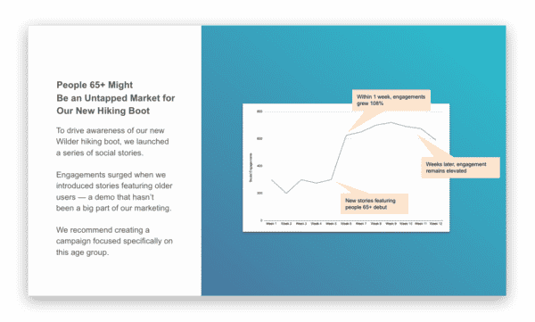
Maybe your social team (the protagonist) needs to increase awareness of a new product (the problem).
To solve that problem, you create a series of social stories featuring the product. Let’s say it’s a new hiking boot because, in this example, you work for an outdoor apparel company. Those stories get an okay level of engagement.
But then something surprising happens.
Your team introduces a series of social stories that feature older users, and suddenly, your likes, shares and comments more than double. And they stay at increased levels for weeks afterwards.
You dig into the data, and you find out that customers age 65 and older really responded to these stories. Not only are your engagement levels up, you’re seeing higher levels of visits to your online store. (All of this — from “To solve that problem” to here — is your plot.)
As a result, you recommend launching a follow-up campaign that really goes after this older demographic, which hadn’t been a big focus for your company. (The ending!)
So when you go and tell your boss about all this, you rework the chart to look like this …
You’re clearly explaining the problem that you were trying to solve (and highlighted why it’s important).
Then you walk through what happened (and why it’s both relevant and interesting).
And then you hit them with the key insight — hey, we may have discovered a really big opportunity!
And maybe, instead of just sending the chart, you write up the story in an email or even grab time to walk them through the narrative in real time.
Now this is a very basic story. Nobody is going to confuse this chart for the latest Pixar movie.
But you’ve done something pretty important. You’ve used a narrative to draw attention to an insight that might have gotten lost in a larger report. And you’ve communicated that point in a way that’s more likely to engage your audience.
Another Way to Structure Data Stories
Gartner has another storytelling model that’s pretty easy to implement. It includes four pieces:
- Description: You explain what happened. You kick off the story by explaining the problem that you were trying to solve (including relevant context about the business, the product or the market) and detailing how you tried to solve it.
- Diagnostic: You explain why things happened the way they did. You can share your analysis of why last month’s campaign succeeded (or failed) beyond your wildest dreams. What lessons did you learn as a result of your efforts?
- Predictive: You forecast what could or will happen next. If you’ve uncovered a trend — your email list is dying a slow and pitiful death — you can forecast the parade of horribles that will follow, i.e. lower conversions and sales.
- Prescriptive: You suggest what should happen next — your expert recommendations, based on the data and the business expertise you bring to bear.
Simple, right? If you’re trying to get people to pay attention, simple is awesome.
Just the Beginning of the Story
To be fair: This is a really high-level look at data storytelling, using some pretty basic examples.
To make your data stories as effective as possible, you might need to think more carefully about what your audience wants, what data will do the best job of answering their questions, and how to engage your audience’s emotions. That’s all beyond the scope of this one blog post.
But really, telling a story doesn’t have to be brain surgery. (Unless your story is about brain surgery, but let’s not go on a tangent.)
By structuring your report as a story, you can make your insights easier to understand and act upon, so they land with a boom and not a thud.
Save Hundreds of Hours on Campaign Reporting and Data Prep
Alight’s end-to-end analytics solutions enable marketers to spend less time on manual data aggregation and more time finding insights. Schedule a free solution consultation with our team!